

Last time we talked about why I’m building course software in Rails from scratch, and built out a basic skeleton of database tables and a first trivial view.
Today, let’s add a theme, build out the view a little more and generally make it look better. I think “Let’s Build” series look better with interesting screenshots, and bare black-and-white new Rails apps don’t make great screenshots.
(Scroll down to get to code and screenshots.)
Bootstrap, TailwindCSS, and “Best”: A Developers Guide to CSS
You’ll hear designers complain a lot about Bootstrap and similar libraries (e.g. Zurb/Foundation.) The complaint goes, “all Bootstrap apps look the same!” If you’re a coder and not a designer, this is a good reason to use them.
Let me explain.

Bootstrap makes the default look pretty okay. What’s “pretty okay?” Here is the styling page for a very basic free Boostrap theme. That’s what I mean by “pretty okay.” If you check the HTML there, they’re doing nothing much fancier than adding classes.
So if you do nothing fancy, you will get output that is pretty okay.
If you try to do fancy, complicated stuff, Bootstrap will fight you. You may have to use “!important” at the end of some of your CSS rules. It’s not a pretty scene.
As a result, the less you customise Bootstrap beyond “add Bootstrap,” the better it will tend to look. Your markup will be short and simple. Your rules will make sense. Swapping out themes will be easy. Redesign-before-last of my blog wound up with half the code (markup and CSS both) and looked far better afterward.
It’s a perfect way to handle design, assuming you don’t want to do any design and you’re slightly afraid of it (I am!)
Designers don’t like it. The same approach applied to code would be SalesForce dot com, which literally uses a little software-in-a-circle-and-slash as their logo.
Are there CSS libraries aimed more at designers? Totally. My favourite example is TailwindCSS. You literally tag every element with exactly what you want it to look like, as though you just used inline styles everywhere.
In other words, with Tailwind, the assumption is that you want full control everywhere with minimal (enforced) uniformity. They assume you know what you’re doing and want not to be interfered with. Bootstrap assumes they should give you uniform defaults and make it painful to deviate from them. In terms of assumptions the two libraries are exact opposites.
So for me it’s Bootstrap all the way. Some day I’ll have the budget to hire an actual designer and they will presumably use something else. It’s as if I was a non-coder building everything in Excel — once I could hire a software engineer they wouldn’t keep doing it in Excel.
If Excel is programming for non-programmers, Bootstrap is design for non-designers.
Now Let’s Add It
I have a Jekyll theme I’ve used to restyle Rebuilding-rails.com and Software-Technique.com… and neither one uses Jekyll. This time I’ll be adapting it to Rails. The theme is called Creative and it’s a light wrapper over Bootstrap. It’s also Apache-licensed, which is convenient.
In this case, the theme is really simple and I’m not (yet) doing much with it. So I can view source on this page and copy-and-paste into a layout. Open-source themes tend to have simple, pretty markup. So “un-Jekylling” it is pretty trivial.
I do also need to grab its dependencies. Luckily the theme is on GitHub so it’s easy to find the JS files and the CSS files in question. It’s also possible to download them directly from the browser, which is what I did. I also skipped FontAwesome, which is heavyweight and needs a lot of files, but the theme only uses it for little icons.

It’s possible to do all this using the Rails asset pipeline and fully adapt it. Right this moment I don’t care, and I’ll bet you don’t want to read through it blow-by-blow regardless. The main advantage I’m giving up here is that Rails will make sure everything is stamped nicely to break the cache exactly often enough. For files I won’t be changing, that’s okay.
With that adaptation, I now have that horrifying thing on the right — a gigantic top header crowds out all the content. That’s less than perfect.
I don’t really want the header, but the navbar up-top really wants a dark background behind it. I think “Ruby Mad Science” is going to wind up with a sketchy-little-pictures aesthetic, because that’s what I can draw for myself. So: sketchy little picture on a dark background, in a header for “Ruby Mad Science.” I’ll just hop into Affinity Designer and…
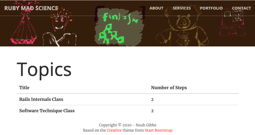
Well now, this isn’t great, but I think it’s headed in the right direction. Also, that yellow whiteboard is eye-searing and needs to go.
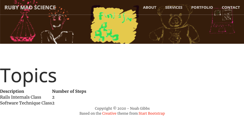
Now the still-default table looks bad, at least by comparison. Time to add classes and get nice default Bootstrap styling.
It turns out that “alert” is a class name used by Bootstrap, so I need to change that for the alert-box snippet I copied from Discourse. That’s where that extra whitespace was coming from. And I added a few more Bootstrappy class names. And the result is… Well, it’s like Bootstrap. I’ll take it.
(Bad footnote: it turns out the original version of this that I stole from Jekyllthemes is ancient, and uses Bootstrap 3 instead of Bootstrap 4. For new projects you always want recent Bootstrap. I have since fixed it. This basic approach still works fine, but make sure to copy the right theme files.)
More and Better
In this post, we talked about reskinning a Rails app with Bootstrap - how, why, and what to expect from the result.
In this blog series, I’ll keep designing this little piece of courseware with a side of small-scale online marketing — I want to send email reminders, for instance, to help folks come back to topics-in-progress later. Want to follow along? Sign up for my email list below or subscribe with the RSS link up-top.


Comments