In this series I’m building courseware (teaching software) to let folks go through lessons in a better way than the simple email classes I use now.
It’s getting close to the point where random users could benefit from it. What’s it’s missing now are email reminders, being deployed (available to use), and… actual content.
Actual content tends to drive more features, though. So in today’s article I’ll take some lessons I’ve already written and start adapting them to this format, and build out new app features to support that.
Where is the App Now?
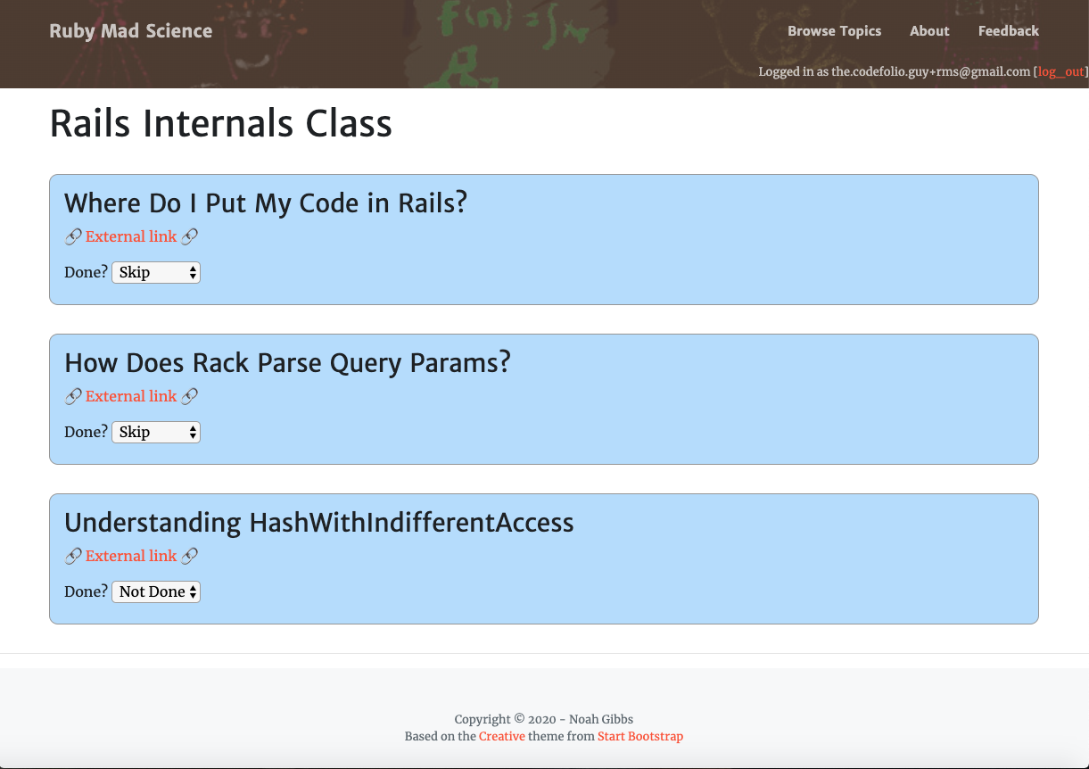
Right now, RubyMadScience has Topics, which are organised into an ordered list of Steps. There’s an arbitrary JSON object, one on each Topic and one on each Step. So the data for Topics and Steps is pretty freeform. We can also mark completion with “Not Done”, “Done” or “Skipped”, and it’s easy to add more “Done”-states. Here’s what a topic looks like right now:

It’s a start. Now let’s make it look better.
As an aside, somebody mentioned Upcase to me after this series started. It’s nice! That’s definitely the kind of thing I’m hoping to do. It also reminds me that a lot of the use of this is the content, not the form. Upcase has excellent form already, but I’m not fond of the way they organise some of the content, and I’d want different content for myself.
Ruby on Rails Internals
I have an old series of “Rails Internals” blog posts. It’d be nice for people to be able to read through them at their own pace rather than having to wait a specific number of days in between. I suspect “some number of blog posts, read them and mark them complete” is going to be a major use-case for RubyMadScience. It’s also fairly simple. So let’s start there.
Technically the screenshot above shows a “maybe good enough” implementation of that - a link to each blog post that opens it in a new window. A selector that sends an AJAX request for updating the “done-ness.” What more do I want? Okay, I want to change that medium blue background on each step. But aside from that, what do I want?
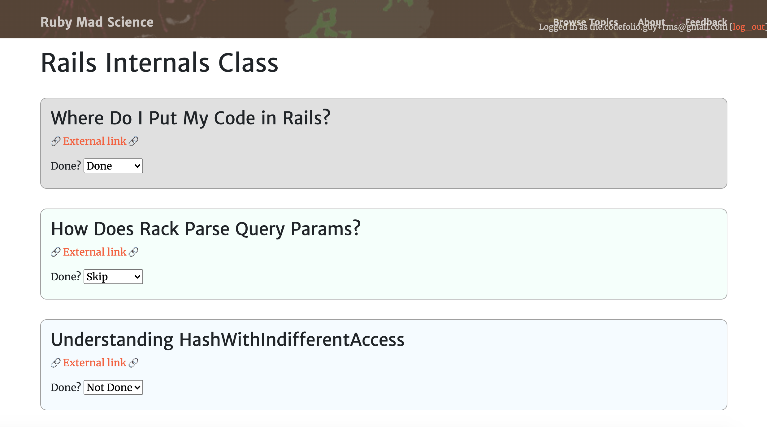
For starters, I want it to feel like a reasonable, natural progression to move forward. Right now the site isn’t doing anything for that. As a nice first step, I think I’ll change the step’s background dynamically when it gets checked off. So when you select a “doneness,” you’ll get a different color. Also I’ll make everything paler. The current blue is too intense.
That means that when the server has accepted a new doneness value, I need to set up a value that the CSS can use to change the color. Here’s the code for changing done-ness, with a new twist:
// steps.js
$("body").on("change", "select.done-select", function() {
    var changed_elt = $(this);
    var step_id = changed_elt.data("step-id");
    var set_value = this.value;

    // Disable the selector until the request finishes
    changed_elt.prop('disabled', true);

    $.ajax("/steps/update_done", {
        method: 'post',
        data: {
            step_id: step_id,
            done: set_value,
            note: "..."
        },
        success: function() {
            $("#select-error-box-" + step_id).text("");
            changed_elt.prop('disabled', false);
            changed_elt.parents(".step-row").attr("data-server-value", set_value);
        },
        error: function() {
            $("#select-error-box-" + step_id).text("(Server error)");
            changed_elt.prop('disabled', false);
            changed_elt.parents(".step-row").attr("data-server-value", "error");
        }
    });
});
I can use that data-server-value attribute on the row div to change the color. Here’s how that looks in topics.scss:
.step-row[data-server-value="0"] {
    background: #F5FBFF;
}

.step-row[data-server-value="1"] {
    background: #F5FFFB;
}

.step-row[data-server-value="2"] {
    background: #E0E0E0;
}

.step-row[data-server-value="error"] {
    background: #FFFBF8;
}
I could also have set a class, but a “data” field with the right value makes more sense to me than converting the data value to a class name.
You can see the whole commit here if you’d like more detail.
Here’s what it looks like now:

I like that. I feel like changing the background color of the step helps the whole page “flow” a bit. Of course, it would be nicer if there were a cleaner-feeling way to check off a task as “done” rather than using a selector.
Cleaner Flow
I feel like the normal case should be “read/watch then click done” with a sort of backup choice for doing anything more complicated - reverting something that had been done, marking a step as “skipped” or adding a note.
So let’s have some kind of a “mark this step done” button as the primary UI, with an alternate UI for doing anything else.

Hrm. First, I tried adding a big “mark done” button (see right) that only appears for steps that are “not done” and then disappears when used. That feels abrupt and a little weird. It probably makes more sense to just enable and disable the button.
I’m also noticing, as I test, that I’m worried about alternate modes. Does this still work when the user isn’t logged in? That means it’s time for some basic testing. Good! I try not to add many tests when behaviour is still highly fluid. But now there’s enough stability that simple tests, probably including Javascript tests, could make a lot of sense. I work fast and loose early on, but it’s a balancing act. A mature project with users needs far more rigour. The trick is adding just enough of it at just the right times. “When it hurts” is a good heuristic. The current lack of tests is starting to hurt.
I also wound up writing a handler method for the button that’s almost, but not quite, exactly like the one for the selector. That’s not great either. So: time for a combined handler and an disabled-not-hidden button (you can see the full commit here.)
The combined handler code is below. I like the handler itself. The two setup functions are so nearly identical that I could clearly move more into the shared part of the function. I’ll do that in a later commit without making you read every line. For now, this works well.
(There’s also a tiny change in the full commit to add the Step ID as data on the ‘mark done’ button so the handler can get it easily.)
var row_update_handler = function(row_jq_object, step_id, set_value) {
    var row_elt = row_jq_object;
    var button_elt = row_elt.find(".mark-done-button");
    var selector_elt = row_elt.find("select.done-select");

    button_elt.prop("disabled", true);
    selector_elt.prop("disabled", true);

    $.ajax("/steps/update_done", {
        method: 'post',
        data: {
            step_id: step_id,
            done: 2,
            note: ""
        },
        success: function() {
            $("#select-error-box-" + step_id).text("");
            selector_elt.prop('disabled', false);
            button_elt.prop('disabled', set_value != 0)
            row_elt.attr("data-server-value", set_value);
            selector_elt[0].value = set_value;
        },
        error: function() {
            $("#select-error-box-" + step_id).text("(Server error)");
            selector_elt.prop('disabled', false);
            row_elt.attr("data-server-value", "error");
        }
    });
}

$("body").on("change", "select.done-select", function(e) {
    var changed_elt = $(this);
    var step_id = changed_elt.data("step-id");
    var set_value = this.value;
    var row_obj = changed_elt.parents(".step-row");

    row_update_handler(row_obj, step_id, set_value);

    e.preventDefault();
});

$("body").on("click", ".mark-done-button", function (e) {
    var button_elt = $(this);
    var step_id = button_elt.data("step-id");
    var row_obj = button_elt.parents(".step-row");

    row_update_handler(row_obj, step_id, 2); // set_value is 2, or "Done"

    e.preventDefault();
});
Real Content
I like the current workflow for hitting ‘done’, and I feel like real content needs to be the next step. More polish at this point would feel premature.
What does this look like with real blog posts inside?
I add another step to the “Rails Internals” topic by hand, in the console and I rapidly realise that this is no way to create content. I’m not sure if I want to take topics out of the database (though I could,) but I’m sure I don’t want to write them this way. I spend ten minutes thinking about a sync scheme to write in JSON files and sync them to the database automatically before realising that there is now no chance that putting Topics in the database makes sense until I’ve grown my (hand-written) content to at least 1000x the current size.
Luckily, this won’t be hard to change yet.
You know what this looks like? Chapter 5 of Rebuilding Rails, where I created non-database models. I think I’m going to do that again, roughly.
Of course, this post is pretty long already. See you next week for that?
(Want to keep following this series? You can sign up for my email list below. There’s an RSS link up-top. There’s a blog tag specifically for the series. Pick your favourite.)


Comments